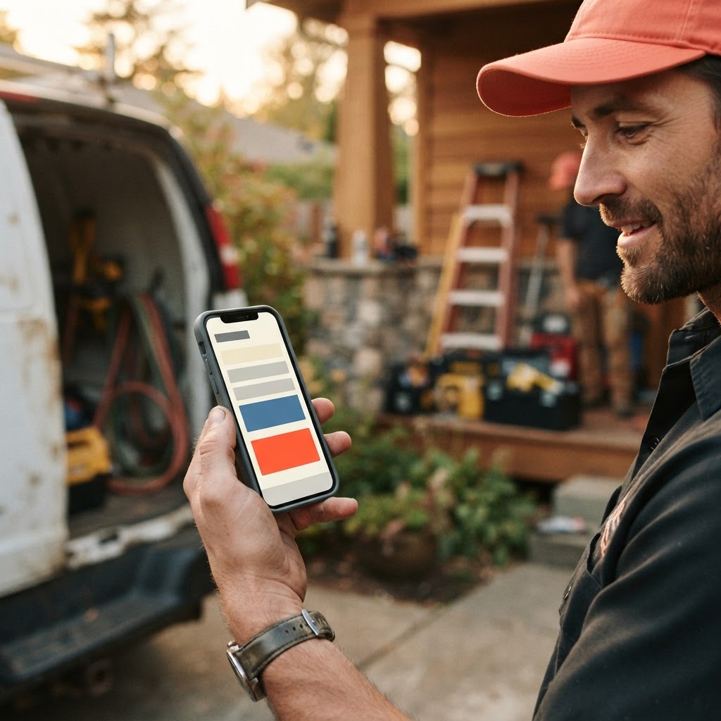
The Hidden Friction on Your Contact Page
Imagine a homeowner, let’s call her Sarah, sitting on her couch at 8:00 PM on a Tuesday. Her water heater just started making a sound like a dying lawnmower. She pulls out her phone, searches for a local plumber, and clicks on your website. She likes what she sees—your photos look professional, and your service area matches her neighborhood. She is ready to hire you. She taps the 'Contact' button, and then she sees it: a massive, intimidating form titled 'Request a Quote' with twelve required fields, including 'Project Budget' and 'Estimated Square Footage.'
Sarah doesn't know the square footage of her utility closet, and she certainly doesn't know how to estimate a plumbing repair. She feels overwhelmed, closes the tab, and clicks on the next result in Google. You just lost a job not because you weren't qualified, but because your website asked for a commitment your customer wasn't ready to make.
For many local service businesses, the 'Request a Quote' button is the digital equivalent of a locked gate. It feels professional, but it creates unnecessary friction for a customer who is already stressed and looking for a quick solution. If your goal is to turn website visitors into booked jobs, you need to stop asking for a 'quote' and start asking for a conversation.
Why 'Request a Quote' Underperforms
The term 'Request a Quote' implies a formal, lengthy process. It suggests that the customer needs to provide detailed specifications, wait for a callback, and perhaps schedule an on-site visit before they even know if you can help them. In the world of local services, speed is the primary currency. When a customer has a problem, they want to know two things: Can you fix it, and when can you be here?
By forcing them into a 'quote' workflow, you are signaling that you are a slow, bureaucratic process. Instead, shift your language to be more inviting and low-pressure. Phrases like 'Book a Service Call,' 'Get a Free Estimate,' or 'Speak to a Pro' feel much more manageable. You aren't asking them to design a project; you are offering to solve a problem.

When you change the language, you change the psychology of the interaction. A 'quote' feels like a transaction; a 'service call' feels like a solution. This simple shift can significantly increase the number of people who actually hit the 'submit' button on your contact form.
The Anatomy of a High-Converting Contact Form
Your contact form should be a lead-generating machine, not a data-collection survey. Most contractors make the mistake of asking for too much information upfront. Every extra field you add to your form is another reason for a potential customer to abandon the page. Keep it short, sweet, and focused on the essentials.
Pro Tip: Limit your contact form to four fields: Name, Phone Number, Service Needed, and Preferred Time. If you need more information, get it during the follow-up call. Your only goal at this stage is to get their contact info so you can start the conversation.
Consider the following comparison of form performance based on typical industry benchmarks for local service businesses:
| Form Type | Fields Required | Conversion Rate (Avg) |
|---|---|---|
| The 'Quote' Survey | 8-12 | 1.5% - 3% |
| The 'Service Request' | 4-5 | 8% - 12% |
| The 'Click-to-Call' Button | 0 | 15% - 20% |
As you can see, the simpler the path, the higher the conversion. If you are using a long, complex form, you are likely losing a significant portion of your traffic to competitors who make it easier to get in touch.
Why Visitors Abandon Contact Forms
Mobile-First is No Longer Optional
More than 60% of local searches happen on mobile devices. If your contact form requires a customer to pinch and zoom to fill out fields, you have already lost them. Your website must be built with a mobile-first mindset, where the 'Call Now' button is always visible and the contact form is optimized for a thumb-tap experience.
At Video-Joy, we see this constantly. A business owner will have a beautiful desktop site, but their mobile experience is a disaster. The buttons are too small, the text is unreadable, and the contact form is buried at the bottom of the page. If your customer has to hunt for your contact information, they will simply hit the back button and choose the next plumber or electrician on the list.
Key Takeaways
| Point | Details |
|---|---|
| Language Matters | Swap 'Request a Quote' for 'Book a Service' to lower pressure. |
| Keep It Simple | Limit forms to 4 fields to maximize completion rates. |
| Mobile First | Ensure your contact buttons are thumb-friendly and fast. |
| Speed Wins | A fast-loading site prevents users from jumping to competitors. |
Conclusion
Your website is your digital front door, and your contact page is the handle. If that handle is stuck or requires a secret code to open, your customers will walk right past your business and into the arms of your competition. By simplifying your language, trimming your forms, and prioritizing a mobile-friendly experience, you can turn your website into a reliable source of new jobs rather than a digital dead end. If you are ready to see what a high-converting, mobile-first site looks like for your specific trade, get a free preview of your business's new website from the team at Video-Joy.