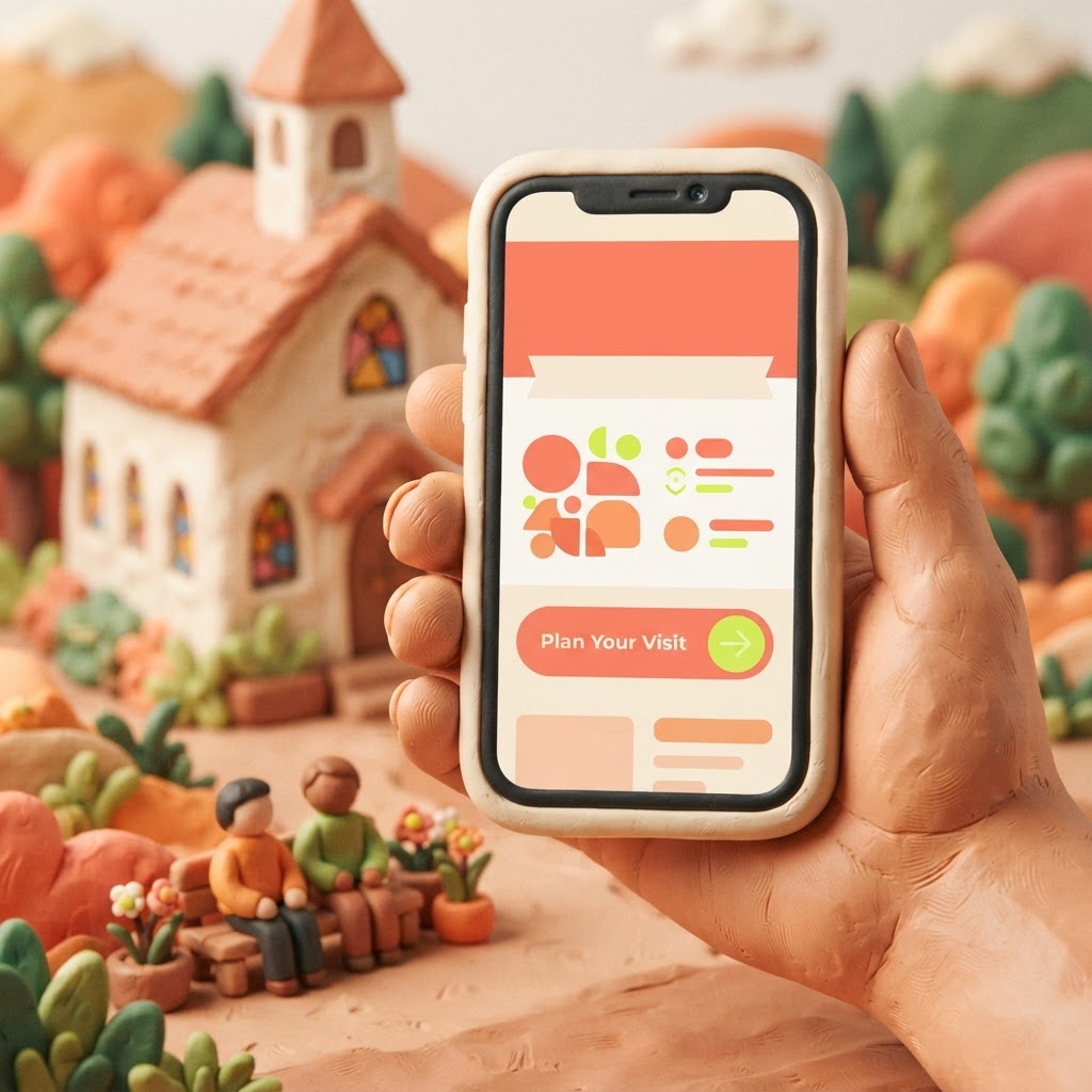
Imagine it is Saturday night. A family new to your town is sitting on their couch, scrolling through their phones. They have decided they want to try a church tomorrow morning, but they are nervous. They do not know the culture, they do not know the parking situation, and they certainly do not want to walk into a room where they feel like outsiders. They type 'church near me' into Google, click your link, and the clock starts ticking.
You have roughly ten seconds to convince them that your church is a place where they belong. In that tiny window, they are not looking for your mission statement, a list of every committee in the building, or a deep dive into your theological history. They are looking for safety, clarity, and a reason to believe that walking through your doors will be a positive experience. If they cannot find what they need immediately, they will close the tab and keep searching.
1. The 'When and Where' (The Absolute Basics)
It sounds obvious, but you would be surprised how many church websites bury their service times and physical address. A first-time visitor is not looking for a 'Contact Us' form to fill out; they are looking for a time and a place. If they have to click through three different pages to find out when the service starts, you have already lost them. Your service times and your physical address should be front and center, ideally in the header or the very top section of your homepage. If they cannot find where to go or when to be there, they simply will not show up.
2. A Clear 'Plan Your Visit' Path
Visiting a new church is intimidating. People have real, practical questions: 'What should I wear?' 'Where do I park?' 'Is there a place for my kids?' A dedicated 'Plan Your Visit' page acts as a digital welcome mat. It removes the guesswork and lowers the barrier to entry. By answering these questions before they even leave their house, you are essentially holding their hand through the process, which builds immense trust before they ever shake a hand in your lobby.
3. Authentic Visuals of Real People
Stock photos of generic, smiling people in a studio setting are easy to spot, and they rarely build trust. When a visitor lands on your site, they want to see what your actual community looks like. They want to see the faces of the people they might be sitting next to. High-quality, authentic photos of your congregation—worshipping, laughing, or serving coffee—tell a story of a real, living community. It helps them visualize themselves in your space, which is a massive step toward them actually showing up.

What Visitors Prioritize in the First 10 Seconds
Pro Tip: Ensure your address is linked directly to Google Maps. A visitor should be able to tap your address on their phone and have their GPS start navigating immediately.
4. Mobile-First Functionality
Most of your visitors are not sitting at a desktop computer; they are on their phones. If your website requires them to pinch, zoom, or scroll horizontally to read your text, they will leave. A mobile-first design is no longer optional—it is the standard. At Video-Joy, we focus on building sites that look just as good on a smartphone as they do on a laptop, ensuring that the 'Plan Your Visit' button is always easy to tap with a thumb.
5. A Single, Clear Next Step
Clutter is the enemy of conversion. If your homepage has a 'Donate' button, a 'Volunteer' link, a 'Sermon Archive' dropdown, and a 'Calendar' all competing for attention, the visitor will feel overwhelmed. Give them one primary call to action: 'Plan Your Visit.' Everything else can live in the menu, but the main focus of your homepage should be inviting them to join you on Sunday.

Key Takeaways
| Point | Details |
|---|---|
| Service Times | Must be visible immediately without clicking. |
| Location | Include a link to Google Maps for easy navigation. |
| Authenticity | Use real photos of your people, not stock images. |
| Mobile Design | Ensure the site is easy to navigate on a phone. |
| One Goal | Focus the homepage on the 'Plan Your Visit' action. |
Pro Tip: Check your site on your own phone today. If you have to search for your service times, your visitor will too—and they won't be as patient as you are.
Conclusion
Your website is the digital front door to your ministry. It is often the very first place a neighbor encounters your church, and that first impression carries a lot of weight. By focusing on these five simple elements, you can turn your website from a static brochure into a welcoming, effective tool for growth. You don't need a massive budget or a team of developers to make these changes; you just need to prioritize the experience of the person who has never walked through your doors. If you are ready to simplify your digital presence, you can get a free preview of your church's new website from Video-Joy today.