
It is 8:00 PM on a Tuesday. A homeowner is sitting on their couch, scrolling through their phone, when they notice a leak under the kitchen sink or realize the HVAC system is making a rhythmic clanking sound. They do not walk to a home office, boot up a desktop computer, and wait for a browser to load. They open Google, type plumber near me, and tap the first result that looks professional and loads instantly.
If your website is not built for that exact moment—the moment of a tired person on a couch with a phone in their hand—you are effectively handing that job to the competitor who is. For local service businesses, the desktop-first era is long gone. Your customers are living in a mobile-first world, and if your digital presence does not reflect that, you are losing more than just traffic; you are losing booked jobs.
The Reality of the Couch Search
We often think of business websites as digital brochures meant to be read on a large monitor. But for a roofer, an electrician, or a landscaper, the website is a utility. It is a tool for someone in a state of mild panic or urgent need. Research consistently shows that mobile devices now account for over 60% of all web traffic, and for local "near me" searches, that number is even higher. When a customer is searching for a local trade, they are almost exclusively doing it from a mobile device.
If your site requires a customer to pinch, zoom, or scroll horizontally to read your services, they will leave. They will not "come back later on a computer." They will hit the back button and click the next link in the search results. In the trades, speed and accessibility are the ultimate competitive advantages.
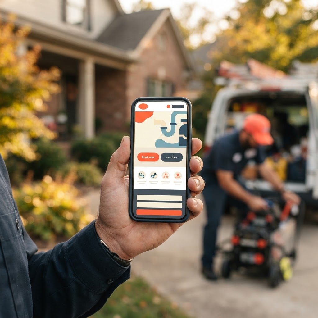
Why Mobile Experience Matters (Illustrative Data)
The Friction That Kills Your Conversion
Think about the last time you tried to use a website that was clearly designed for a desktop on your phone. You had to squint to read the text, the buttons were too small to tap with your thumb, and the images took forever to load. That friction is a conversion killer. For a local business, every second of load time is a potential customer walking out the door.
Pro Tip: If you want to test your site, open it on your phone right now. If you have to zoom in to read your phone number or find the 'Request a Quote' button, your site is actively costing you money.
A mobile-first website removes these barriers. It prioritizes the information a customer needs immediately: what you do, where you do it, and how to get in touch. At Video-Joy, we focus on stripping away the clutter that slows down mobile browsers, ensuring that your site is as fast and reliable as your crew on a job site.
What Homeowners Actually Look For
When a customer lands on your site from their couch, they are not looking for a 500-word essay on the history of your company. They are looking for three things: proof that you are legitimate, proof that you can solve their specific problem, and an easy way to contact you. A mobile-first layout organizes this information into a vertical flow that is easy to scan.
| Feature | Desktop-Heavy Site | Mobile-First Site |
|---|---|---|
| Navigation | Complex, multi-level menus | Simple, thumb-friendly buttons |
| Contact | Hidden in a footer | Sticky 'Call Now' button |
| Content | Long paragraphs | Bullet points and clear headers |
| Speed | Slow, heavy images | Optimized, fast-loading assets |
Building Trust Without the Desktop
Trust is the currency of the trades. On a mobile device, trust is built through clarity. A clean, fast-loading site that displays your recent work and clear contact information tells the customer, "We are professional, we are active, and we are ready to help." If your site looks like it was built in 2010, the customer assumes your business practices are just as outdated.
By focusing on a mobile-first approach, you are not just making your site look better; you are making it a functional part of your sales team. It works 24/7, answering the questions that keep homeowners up at night, and guiding them toward the "Call" or "Quote" button before they ever have to think about a desktop computer.
Key Takeaways
| Point | Details |
|---|---|
| Mobile Dominance | Nearly 90% of local searches happen on mobile devices. |
| Speed Matters | A 3-second load time is the threshold where you lose 40% of visitors. |
| User Intent | Customers on mobile want quick answers and easy contact buttons. |
| Trust Factor | A modern, mobile-responsive site signals professionalism. |
Conclusion
Your customers are not waiting to get to a desk to find a solution to their home service needs. They are searching from the couch, the car, and the job site. If your website is not built to meet them there, you are leaving money on the table every single day. It is time to stop worrying about how your site looks on a 27-inch monitor and start focusing on how it performs on a 6-inch screen. Video-Joy builds fast, mobile-first websites for local businesses — and builds a free preview of the business's new website before they pay anything. You can get a free preview of your business's new website today and see exactly how your brand should look in the hands of your next customer.