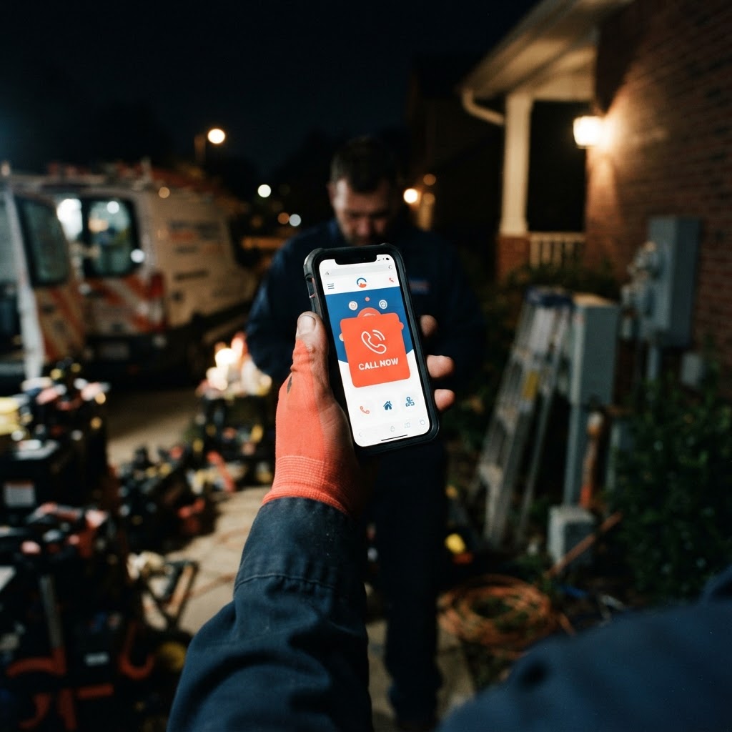
It is 2:00 AM. A homeowner wakes up to the sound of water spraying behind their drywall. They grab their phone, bleary-eyed, and type 'emergency plumber near me' into Google. They click the first result, but the site takes five seconds to load, the text is microscopic, and they cannot find a 'Call Now' button anywhere. Frustrated, they close the tab and click the next link. By the time your office opens at 8:00 AM, that customer has already booked someone else.
This scenario plays out thousands of times every night across the country. For local service businesses—plumbers, HVAC techs, electricians, and roofers—your website is not just a digital brochure. It is your 24/7 dispatcher. If it is not built to handle the urgency of a mobile search, you are essentially paying to send your best leads to your competitors.
Why Your Website Is Losing the 'Midnight' Battle
Most business owners think their website is 'fine' because it looks good on a desktop monitor in their office. But your customers aren't sitting at desks when their water heater bursts or their AC dies. They are on their couches, in their basements, or standing in their driveways, holding a smartphone. If your site requires them to pinch-and-zoom to read your phone number, you have already lost the job.
A mobile-first website isn't just about making things smaller; it is about prioritizing the actions that matter. When someone is in a panic, they don't want to read your company history or look at a gallery of your trucks. They want to know three things: Can you fix this? Are you nearby? How do I call you right now?
Pro Tip: Place your 'Call Now' button in the top-right corner of your mobile header and make it a 'sticky' element that stays visible even as the user scrolls down the page.
The Cost of a Clunky Mobile Experience
When a website is not optimized for mobile, the bounce rate—the percentage of people who leave immediately—skyrockets. Research suggests that even a one-second delay in load time can drop conversion rates significantly. For a local service business, this translates directly into lost revenue.
Impact of Mobile Friction on Lead Conversion
These figures are illustrative of the conversion gap we see when comparing sites that respect the user's time versus those that force them to fight the interface. If your site is hard to use, the customer assumes your service will be hard to schedule.
Designing for the 'Emergency' Mindset
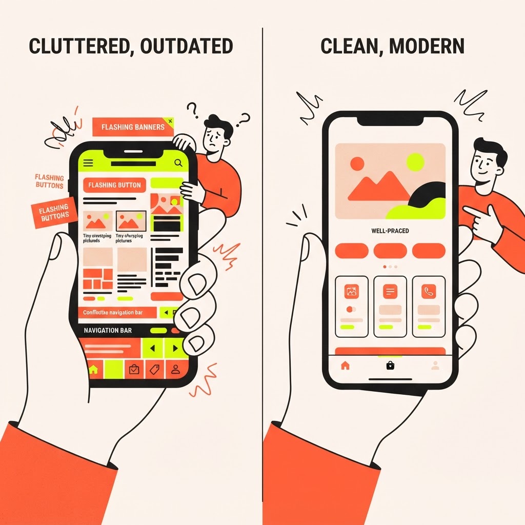
Let’s look at a plumbing company we will call Lopez Plumbing. Before their redesign, their site was a beautiful, image-heavy desktop site that took forever to load on 4G. They were getting traffic, but their phone wasn't ringing. We stripped the site down to the essentials: a clear headline, a 'Call Now' button, and a simple form for non-emergency requests. We prioritized speed and readability above all else.
The result? Their mobile conversion rate tripled within three months. They stopped trying to impress visitors with fancy animations and started helping them solve problems. That is the difference between a website that is a vanity project and one that is a business tool.
| Feature | Old Site (Desktop-First) | New Site (Mobile-First) |
|---|---|---|
| Load Time | 5-8 Seconds | Under 2 Seconds |
| Primary CTA | Hidden in Menu | Sticky 'Call Now' Button |
| Text Size | Small/Hard to Read | Large/High Contrast |
| Navigation | Complex Dropdowns | Simple, Thumb-Friendly |
The Anatomy of a High-Converting Service Site
To turn those midnight searches into morning calls, your site needs to be built with a specific hierarchy. First, your contact information must be the most prominent element on the screen. Second, your service area should be clearly defined so the user knows immediately that you serve their neighborhood. Third, use social proof—like a star rating or a quick testimonial—right next to your contact button to build instant trust.
Pro Tip: Avoid using pop-ups on mobile devices. They are notoriously difficult to close on small screens and often block the very information the user is trying to find, causing them to leave your site in frustration.

Key Takeaways
| Point | Details |
|---|---|
| Mobile-First | Design for the phone screen before the desktop monitor. |
| Speed Matters | A site that loads in under 2 seconds keeps leads on the page. |
| Clear CTA | Make your phone number a clickable button that is always visible. |
| User Intent | Focus on solving the customer's immediate problem, not your brand story. |
Conclusion
Your website is the first handshake a customer has with your business. If that handshake is limp, confusing, or non-existent, they will move on to the next name on the list. By focusing on speed, mobile usability, and clear calls to action, you can ensure that when a customer is in a bind, your business is the one they choose to call. At Video-Joy, we specialize in building fast, mobile-first websites for local businesses that actually turn visitors into paying customers. If you are ready to stop losing leads to a clunky site, get a free preview of your business's new website and see the difference for yourself.