The 'Request a Quote' Page Most Contractor Websites Get Wrong
The Silent Lead Killer on Your Website
Imagine a homeowner, let’s call him Dave, sitting on his couch at 9:00 PM. His water heater just started leaking, and he’s frantically searching for a local plumber. He clicks on your website, sees your professional branding, and thinks, 'This looks like the right crew.' He clicks the 'Request a Quote' button, ready to hand you his business. Then, he sees it: a form that asks for his home address, his budget, his preferred appointment time, and a detailed description of the pipe material. Dave sighs, closes the tab, and clicks the next link in his search results. You just lost a job because your form felt like a tax audit.
For local service businesses—plumbers, HVAC techs, roofers, and electricians—the 'Request a Quote' page is often the most neglected piece of digital real estate. It is the final gate between a visitor and a paying customer. Yet, many business owners treat it like a data collection center rather than a sales tool. If your form is long, confusing, or asks for information you don't actually need to start a conversation, you are actively paying to send leads to your competitors.
Why Less Is Almost Always More
The goal of your website form is not to complete the entire sales process; it is to start a conversation. Every extra field you add creates friction. Research consistently shows that removing unnecessary fields can boost conversion rates significantly. If you are asking for a customer's full mailing address, date of birth, or specific budget range before you have even spoken to them, you are creating a barrier that most busy homeowners won't bother to climb.
Think about what you actually need to call a lead back. You need a name, a way to reach them (phone or email), and a general idea of what they need help with. That is it. Everything else—the specific model of their furnace, the square footage of their roof, or their preferred Tuesday afternoon slot—can be gathered during the actual discovery call. By keeping the initial form lean, you respect the customer's time and increase the likelihood that they will hit 'Submit.'
Pro Tip: If you are worried about lead quality, don't add more fields to the form. Instead, add a simple 'Service Type' dropdown menu. This helps you route the lead to the right person on your team without forcing the customer to write a paragraph about their problem.
The Anatomy of a High-Converting Form
A high-converting form is built on clarity and trust. Customers are wary of spam and cold calls, so your form needs to signal that you are a real, professional business. Use clear, human-language labels. Instead of a generic 'Comments' box, try 'What can we help you with today?' This small change makes the interaction feel like a conversation rather than a data entry task.
Furthermore, ensure your labels are placed above the fields, not inside them. When labels disappear as soon as a user starts typing, it creates unnecessary cognitive load—the user has to remember what they were supposed to enter. Keep it simple, keep it visible, and keep it fast.

Impact of Form Length on Conversion Rates
The data above is illustrative of common industry trends where form length is inversely proportional to conversion success. Every field added beyond the essentials acts as a filter that removes potential customers who are simply looking for a quick, reliable solution.
Common Mistakes That Cost You Jobs
Beyond length, there are technical and psychological hurdles that kill leads. One of the most common is the 'Submit' button. If your button says 'Submit' or 'Send,' you are missing an opportunity. Use action-oriented, benefit-driven text like 'Get My Free Quote' or 'Request Service.' It sounds small, but it changes the user's mindset from 'I am sending data' to 'I am getting a result.'
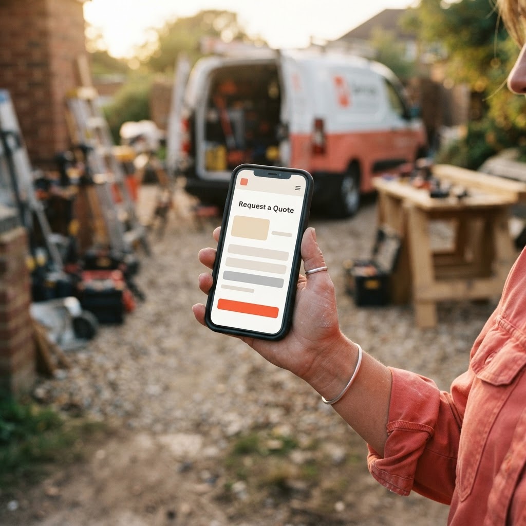
Another major issue is mobile responsiveness. Most of your customers are searching on their phones while standing in their kitchen or garage. If your form requires them to pinch, zoom, or scroll horizontally to see the fields, they will leave. At Video-Joy, we focus on building mobile-first experiences because we know that for a local service business, the 'Request a Quote' page is often viewed on a 6-inch screen, not a 27-inch monitor.
| Feature | The 'Wrong' Way | The 'Right' Way |
|---|---|---|
| Field Labels | Inside the box (disappears) | Above the box (always visible) |
| Button Text | Submit | Get My Free Quote |
| Required Fields | Everything is required | Only name and contact info |
| Privacy | None | 'We never share your info' |
| Validation | Error after clicking | Real-time as they type |
Building Trust at the Point of Contact
Your form is also a trust signal. If a customer is about to give you their phone number, they want to know what happens next. Add a small line of text below the form: 'We will call you within 2 hours to discuss your project.' This sets expectations and reduces the anxiety of 'Will they ever call me back?'
You can also include a small security badge or a note saying, 'Your information is secure and never shared.' These tiny details reassure the customer that they are dealing with a professional, established business rather than a fly-by-night operation. Trust is the currency of the trades; your website should reflect that.
Pro Tip: If you find you are getting too many 'junk' leads, don't make the form harder. Instead, add a 'How did you hear about us?' dropdown or a simple checkbox that says 'I am the homeowner.' This filters out solicitors without adding friction for your real customers.
Key Takeaways
| Point | Details |
|---|---|
| Keep it Lean | Only ask for name, contact, and service type. |
| Mobile First | Ensure the form is easy to use on a smartphone. |
| Clear Labels | Place labels above fields for better readability. |
| Set Expectations | Tell them exactly when you will follow up. |
| Action Buttons | Use benefit-driven text like 'Get My Quote.' |
Conclusion
Your 'Request a Quote' page should be the easiest part of your customer's day. By stripping away the unnecessary questions and focusing on a fast, mobile-friendly experience, you turn your website into a 24/7 salesperson that actually works for you. Don't let a clunky form stand between you and your next big job. If you are ready to see how a streamlined, professional site can help you capture more leads, get a free preview of your business's new website and let us show you what a high-converting design looks like for your specific trade.