The 3-Second Rule: Building a Church Homepage That Actually Works
The Digital Front Door
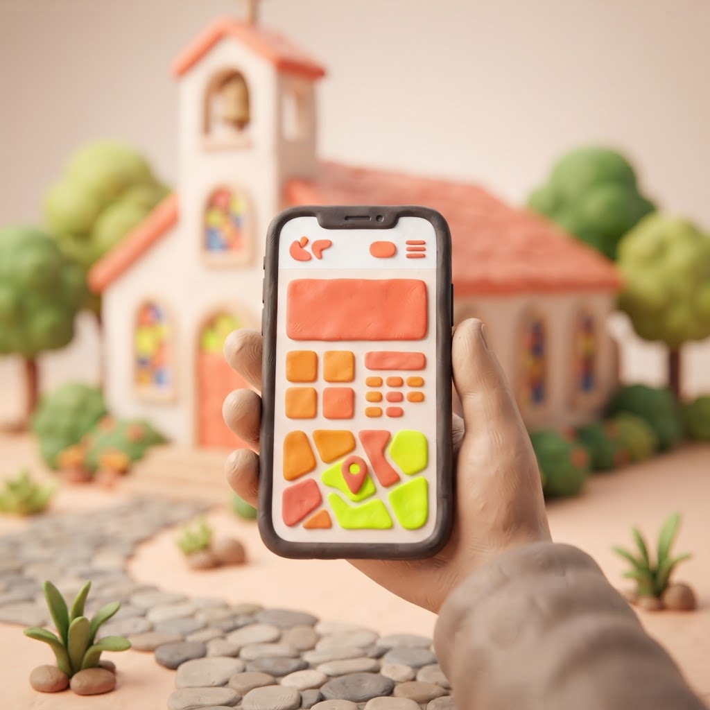
Imagine a family pulls into your church parking lot on a Sunday morning, but they find the front doors locked, the lights off, and a sign on the door from three years ago. You would never let that happen in person, yet many churches inadvertently do this every single day online. Your website is the digital front door of your ministry. For most people, it is the very first place they look before they ever step foot in your building.
Research suggests that at least 85 percent of first-time guests visit a church’s website before attending in person. If they land on your page and cannot immediately find out when you meet or where you are located, they will likely click away within seconds. It is not that they are uninterested; it is that they are busy, and they are looking for clarity. When your site is cluttered or outdated, it sends a silent message that your church might be disorganized or inactive.
The good news is that you do not need a massive budget or a degree in computer science to fix this. You simply need to prioritize the information that actually matters to a newcomer. By focusing on three core pillars—service times, location, and a clear next step—you can transform your website from a digital brochure into a welcoming invitation.
The Anatomy of a High-Converting Homepage
When a visitor lands on your homepage, they are usually asking three questions: When do you meet? Where are you? And what happens if I show up? If they have to hunt for these answers, you have already lost them. Your homepage should be designed with a clear hierarchy that guides the user’s eye exactly where it needs to go.
The most effective layouts use a simple, uncluttered design. Avoid the temptation to put every ministry, calendar event, and committee meeting on the front page. Instead, treat your homepage like a concierge. Its only job is to help the visitor get to the next step of their journey. Keep your menu simple, your text concise, and your call-to-action buttons bold and easy to find.
Pro Tip: Never use a website slider or rotating banner on your homepage. They often confuse visitors and slow down your site speed, which can hurt your search engine rankings. Stick to one strong, clear focal point.
To help you audit your current site, consider this breakdown of what visitors are actually looking for versus what they often find:
| Visitor Need | Common Mistake | The Fix |
|---|---|---|
| Service Times | Buried in a footer or sub-page | Bold text in the top navigation |
| Location | Vague description | Embedded map with parking info |
| What to Expect | Internal jargon or 'insider' language | A 'Plan Your Visit' page |
| Contact | No clear way to reach out | A simple, working contact form |
Why Your Website Speed and Searchability Matter
Even the most beautiful website is useless if no one can find it. When someone searches for a church in your area, you want to be the first result they see. This is where search engine optimization (SEO) comes in. You do not need to be a tech expert to improve your rankings; you just need to be intentional about the words you use on your site.
Ensure your city and the word 'church' appear in your page titles and headers. For example, instead of just 'Welcome to Our Home,' use 'Welcome to Grace Community Church in Springfield.' This tells Google exactly who you are and where you are located. Additionally, keep your site fast. Large, uncompressed images are the most common culprit for slow loading times. If your site takes more than three seconds to load, most mobile users will leave before they even see your logo.
Why Visitors Leave Your Website

The Power of Real Connection
People are looking for community, not just a building. When you use stock photos of people who don't actually attend your church, visitors can sense the lack of authenticity. Use real photos of your congregation—people laughing, serving, and worshiping together. This helps a potential visitor visualize themselves in your space. It turns a cold, digital interaction into a warm, human one.
At Video-Joy, we believe that your website should be as vibrant as your ministry. We specialize in building fast, mobile-first websites for churches that prioritize the visitor experience. We handle the technical heavy lifting so you can focus on the people. If you are ready to see what a modern, effective site could look like for your congregation, you can get a free preview of your church's new website before you pay a single cent.

Key Takeaways
| Point | Details |
|---|---|
| The 3-Second Rule | Visitors decide to stay or leave in seconds; make info obvious. |
| Core Essentials | Always display service times, address, and a 'Plan Your Visit' link. |
| SEO Basics | Use your city and 'church' in your page titles to be found. |
| Authenticity | Use real photos of your people to build trust and belonging. |
| Mobile First | Ensure your site looks great on a phone, as most will view it there. |
Conclusion
Your church website is more than just a digital placeholder; it is a tool for ministry. By simplifying your message and focusing on the needs of the newcomer, you remove the barriers that keep people from walking through your doors. You have a story to tell and a community to share—don't let a confusing website stand in the way. Take a moment this week to look at your homepage through the eyes of a stranger, and ask yourself if it truly says, 'We are ready for you.' If you need a partner to help you build that digital front door, we are here to help.