How One Church Redesign Turned Online Searches Into First-Time Visits
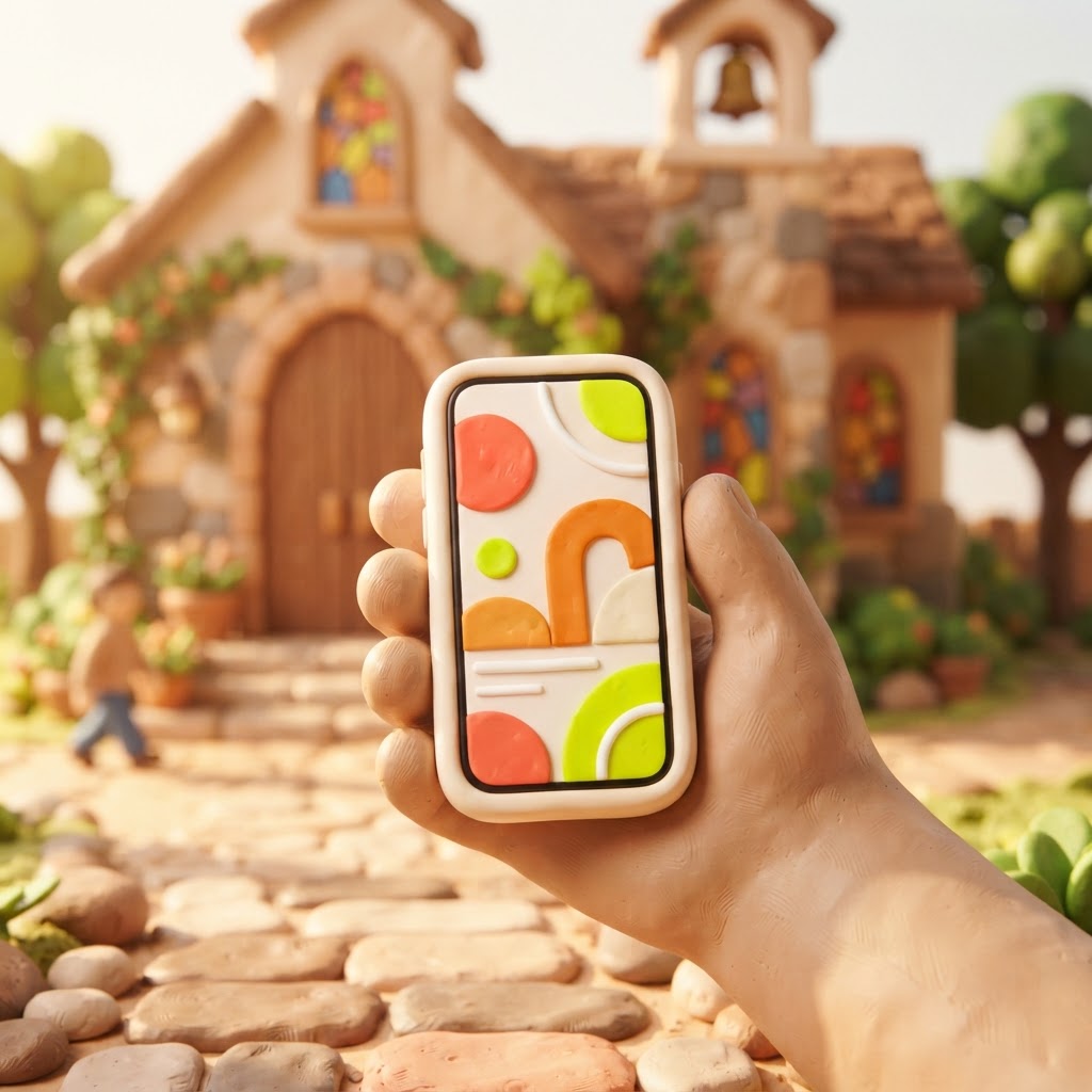
Imagine a family moves into your neighborhood on a Tuesday. By Thursday, they are curious about finding a local church. They pull out their phones, type church near me into Google, and start clicking. They land on your website. Within five seconds, they decide whether to visit you this Sunday or keep scrolling. For many churches, this digital first impression is the only one they get.
We recently worked with a church we will call Grace Community. Their leadership team was frustrated. They knew they were a welcoming, vibrant congregation, but their online presence told a different story. Their old site was cluttered, hard to read on a phone, and buried their service times under three layers of menus. They weren't just losing visitors; they were invisible to the very people looking for a home.
When they finally committed to a redesign, they didn't just change the colors. They changed their perspective. They stopped thinking like an organization and started thinking like a first-time guest. The result was a steady increase in new faces walking through their doors, not because they changed their mission, but because they finally removed the barriers keeping people from finding it.
The Digital Front Door: Why Your Website Matters
Most people today do not ask a neighbor for a church recommendation first. They search online. If your website is outdated, slow, or confusing, it sends a silent message that your church might be inactive or disorganized. A modern, mobile-first website acts as a 24/7 greeter. It builds trust before a person ever steps into your parking lot.
The goal of a church website isn't to win design awards; it is to answer the questions that keep a guest from showing up. When a visitor lands on your page, they are usually asking: Where do I go? What should I wear? Will my kids be safe? If they have to hunt for the answers, they will likely leave.
Common Roadblocks That Turn Visitors Away
Many churches inadvertently create friction. We see these patterns often, and they are almost always unintentional. The most common issue is a lack of clarity regarding the basics. If your service times are not immediately visible on the homepage, you are asking a potential guest to work for the information. In our experience, if a user has to click more than twice to find when and where to show up, they are likely to move on to the next search result.
Another major hurdle is the mobile experience. Most of your traffic is coming from a smartphone. If your site requires pinching and zooming to read text, or if the buttons are too small to tap, you are effectively telling mobile users that they aren't your priority. A mobile-first design ensures that your site looks clean and functions perfectly on any device.
Why Visitors Leave (Illustrative Data)

The Power of Authentic Content
One of the biggest mistakes churches make is relying on generic stock photography. When a visitor sees a photo of a model in a suit holding a Bible, they don't see your church. They see a marketing brochure. Use real photos of your actual building, your actual volunteers, and your actual community. Authenticity builds trust.
Pro Tip: Use your website to answer the 'What should I expect?' question. A short video or a simple list of FAQs about parking, kids' check-in, and service length can significantly lower the anxiety of a first-time guest.
At Video-Joy, we believe that your website should feel like a preview of the Sunday experience. When the digital version matches the in-person reality, you remove the fear of the unknown. This is why we focus on building fast, mobile-first websites that highlight your unique culture.
A Simple Checklist for Your Homepage
You don't need a massive budget to make your site more effective. Start by auditing your homepage against this list. If you are missing these elements, prioritize them in your next update.
| Element | Why it matters |
|---|---|
| Service Times | The #1 thing guests look for. |
| Location/Map | Confirms you are local and accessible. |
| Clear Call to Action | Tells them exactly what to do next. |
| Real Photos | Shows the human side of your ministry. |

Key Takeaways
| Point | Details |
|---|---|
| Mobile First | Most guests will find you on a phone. |
| Clarity Wins | Answer the basic questions immediately. |
| Authenticity | Use real photos, not stock images. |
| Consistency | Keep your info updated across all platforms. |
Pro Tip: Don't try to do everything at once. Start by fixing your service times and location details. Once those are clear, move on to improving your photos and navigation.
Conclusion
Your website is more than just a collection of pages; it is a tool for ministry. When you make it easy for people to find you, you are essentially saying, We are ready for you, and we have a place for you here. By focusing on clarity, mobile accessibility, and authentic connection, you can turn those anonymous online searches into meaningful, in-person relationships.
If you are ready to see what a modern, mobile-first site could look like for your ministry, we would love to help. You can get a free preview of your church's new website today, with no obligation and no pressure.