From Search to Sanctuary: How One Church Redesign Changed Everything
Imagine a family sitting at their kitchen table on a Saturday night. They’ve recently moved to your town, and they’re looking for a place to belong. They pull out a smartphone, type 'church near me' into Google, and click the first link that looks local. They land on your homepage. Within three seconds, they decide whether they feel welcome enough to walk through your doors tomorrow morning or if they’ll keep scrolling to the next option.
For many churches, that digital 'front porch' is cluttered, outdated, or simply hard to navigate. It’s not that the ministry isn't vibrant; it’s that the online presentation doesn't match the warmth of the community inside. We recently worked with a church we’ll call Grace Community, which was struggling with this exact disconnect. Their pews were full of life, but their website was a maze of old event calendars and broken links. By shifting their focus from 'announcing events' to 'welcoming strangers,' they saw a measurable shift in new faces appearing on Sunday mornings.
The Three-Second Rule for First Impressions
When a visitor lands on your site, they aren't looking for your church history or a deep dive into your administrative structure. They are looking for three things: Where are you? When do you meet? And will I feel comfortable there? If they have to hunt for these answers, they will leave. A successful redesign prioritizes these basics above everything else. Your homepage should be a clear, uncluttered invitation that answers the 'who, when, and where' immediately.
Pro Tip: Audit your homepage today by asking a friend who has never attended your church to find your service time and address in under ten seconds. If they struggle, your design is likely creating a barrier to entry.
The goal is to reduce the 'cognitive load' on the visitor. Every extra click is a potential point of friction where a visitor might decide it’s just too much effort to figure out your church. By simplifying your navigation and putting the most critical information front and center, you aren't just fixing a website; you are removing the obstacles between a seeker and a community.

Why Mobile-First Design is No Longer Optional
It is a common misconception that people sit down at a desktop computer to research a church. The reality is that the vast majority of your potential visitors are searching on their phones while on the go. If your website requires them to pinch, zoom, or scroll horizontally to read your service times, you are effectively telling them that your church isn't built for their modern life.
Visitor Behavior: Desktop vs. Mobile
This data, illustrative of current trends in local search, highlights why a mobile-first approach is essential. When we help churches redesign their sites, we ensure that the mobile experience is not just a 'shrunken' version of the desktop site, but a streamlined, touch-friendly interface that makes finding information effortless.
Moving Beyond the 'About' Menu
Many churches make the mistake of hiding their identity behind a complex dropdown menu. If a visitor has to click 'About,' then 'Staff,' then 'Beliefs' just to get a sense of who you are, they will likely bounce before they see a single face. Instead, create a single, cohesive 'About' page that tells your story, introduces your leadership, and shares your values in one scrollable, human-centered experience.
| Feature | Old Approach | Visitor-Friendly Approach |
|---|---|---|
| Navigation | Complex, multi-level menus | Simple, clear, action-oriented |
| Imagery | Generic stock photos | Real photos of your people |
| Information | Hidden in sub-pages | Visible on the homepage |
| Call to Action | None or 'Contact Us' | 'Plan Your Visit' or 'Ask a Question' |
The Power of Real Imagery
Nothing builds trust faster than seeing real people. Stock photos of people in suits shaking hands in a sterile office don't reflect the messy, beautiful reality of a church family. Use high-quality, authentic photos of your actual congregation. When a visitor sees a photo of your worship team, your greeters, or your coffee hour, they start to visualize themselves in that space. It turns an abstract concept of 'church' into a tangible community they can join.
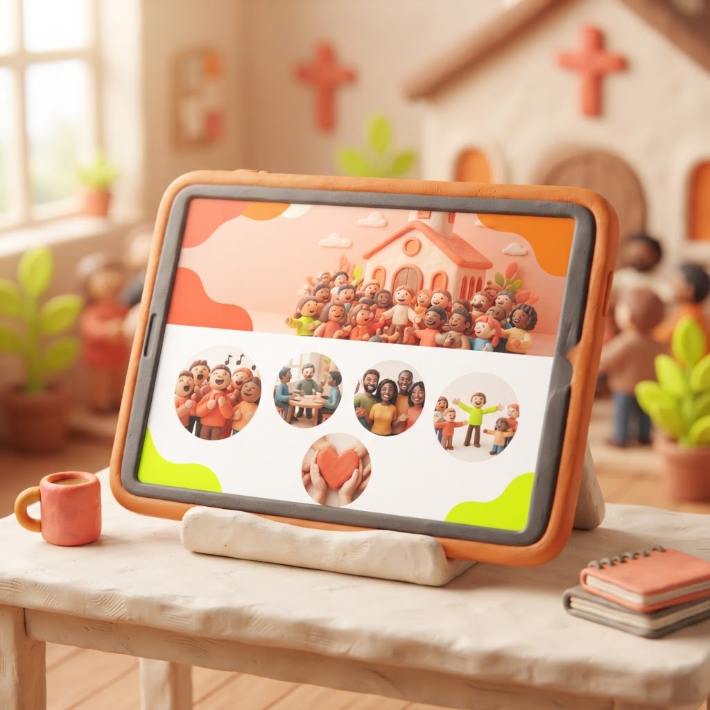
Pro Tip: If you don't have a professional photographer, ask a talented volunteer to spend one Sunday capturing candid moments of connection rather than just the stage. Authentic smiles and real interactions are worth more than any stock image.
Key Takeaways
| Point | Details |
|---|---|
| Prioritize Basics | Service times, address, and contact info must be visible instantly. |
| Mobile-First | Design for the phone in the visitor's pocket, not the desktop. |
| Humanize | Use real photos of your congregation to build immediate trust. |
| Simplify | Remove barriers like complex menus that hide your identity. |
| Clear CTA | Give visitors a specific, low-pressure next step. |
Conclusion
A church website redesign isn't about vanity or having the latest tech; it’s about stewardship. It’s about ensuring that the digital front door of your ministry is as welcoming as the physical one. When you remove the friction, you allow people to focus on what really matters: the message of the Gospel and the community you offer. If you are ready to stop worrying about your website and start focusing on your ministry, we can help. Video-Joy builds fast, mobile-first websites for churches — and builds a free preview of the church's new website before they pay anything. You can get a free preview of your church's new website today.